VIEW

READ MORE

Energy for tomorrow

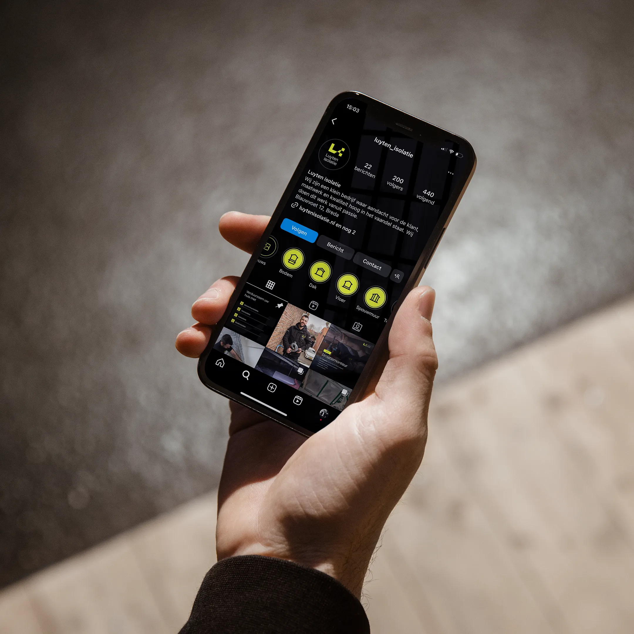
Visual identity with a quality appearance

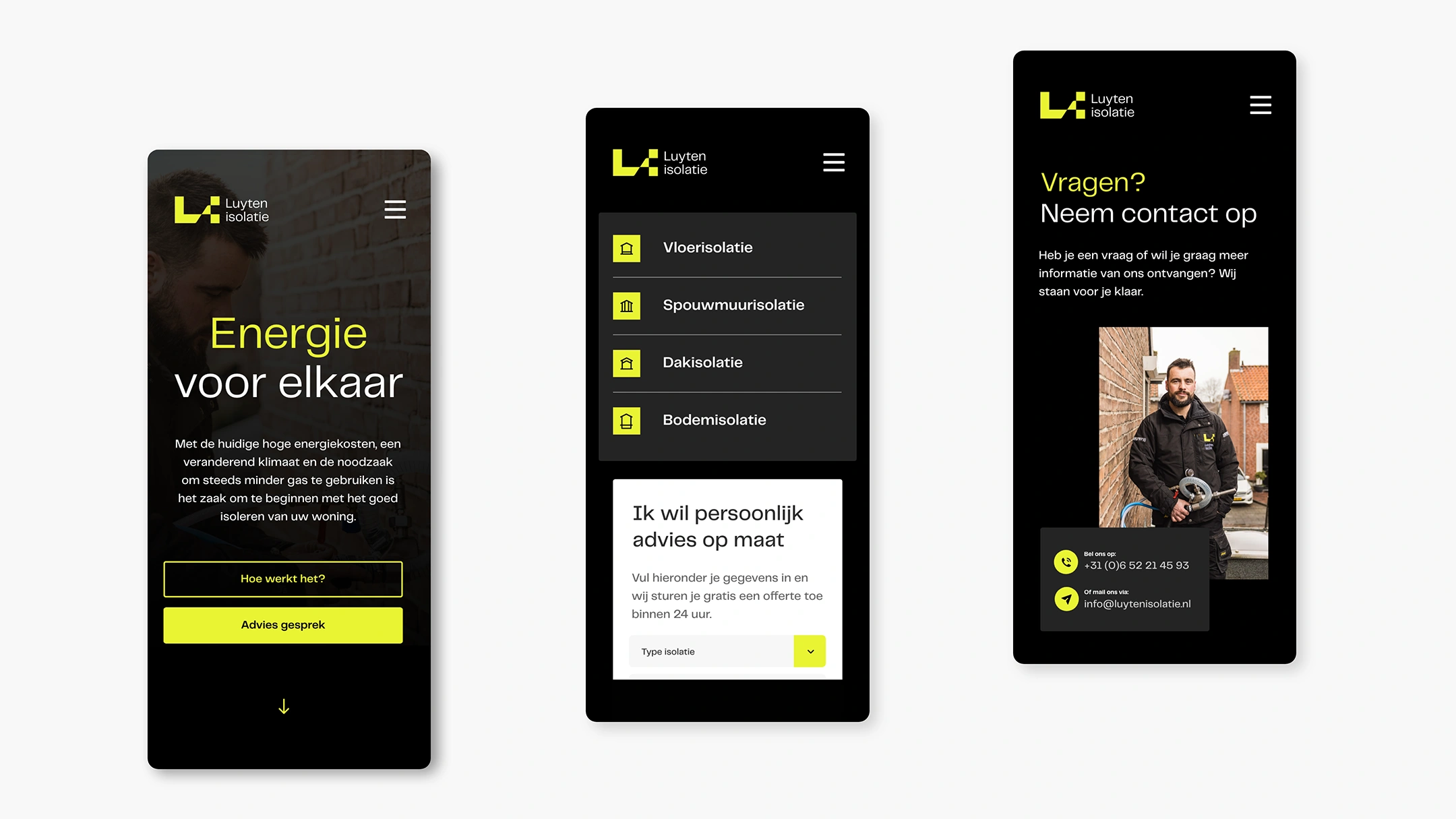
Custom web design strengthens the concept

Personal photography for the human touch

Luyten insulation

Luyten Isolatie focuses on making homes more sustainable. With current high energy costs, a changing climate, and the need to use less and less gas, it's crucial to start by properly insulating every home.

The opportunity to take the company to the next level was also apparent at Luyten Insulation: developing a brand that would be at the top of the home insulation market.

"I need to be seen"

The visual identity reflects the brand's personality. There's a thought behind every color, font, style of photography, or illustration, and that's also true for Luyten Insulation. The modern logo embodies the company name and vision. Furthermore, the dark hues emphasize the robust character of Luyten Insulation. Combined with the bright yellow, this creates a fresher, more energetic, and more modern look.

The human touch

A personal approach. Not only in writing, but also in images. The photography gives the brand a friendly character. An added benefit is that these personal, engaging images increase trust in the brand. A brand that radiates energy.

Digital

There's a wide range of options available on the market for consumers looking for sustainability, but there's very little, if any, support to guide them in the right direction. Therefore, the web design focuses on making all the necessary information about high-quality and affordable insulation options accessible. Users are guided towards the most suitable solution. Such a user experience is energizing!

Fire Brigade Brabant-North

Connecting Processes